Redesign Workflow Builder
Background and Business Context
In a data security permissions management system, a significant need arose to improve the user experience of the Workflow creation feature.
I initiated this change based on qualitative observations of the Technical Customer Support (TCS) team. Although not the original target audience, they had become the main users of the feature in practice.

Product
Database Access Management System
My Role
Product Designer
Team
Solo work in collaboration with the CPO and the R&D team
Goal
Redesign of an existing feature, the Workflow Builder, used by Technical Customer Support (TCS) team
Identified Issues
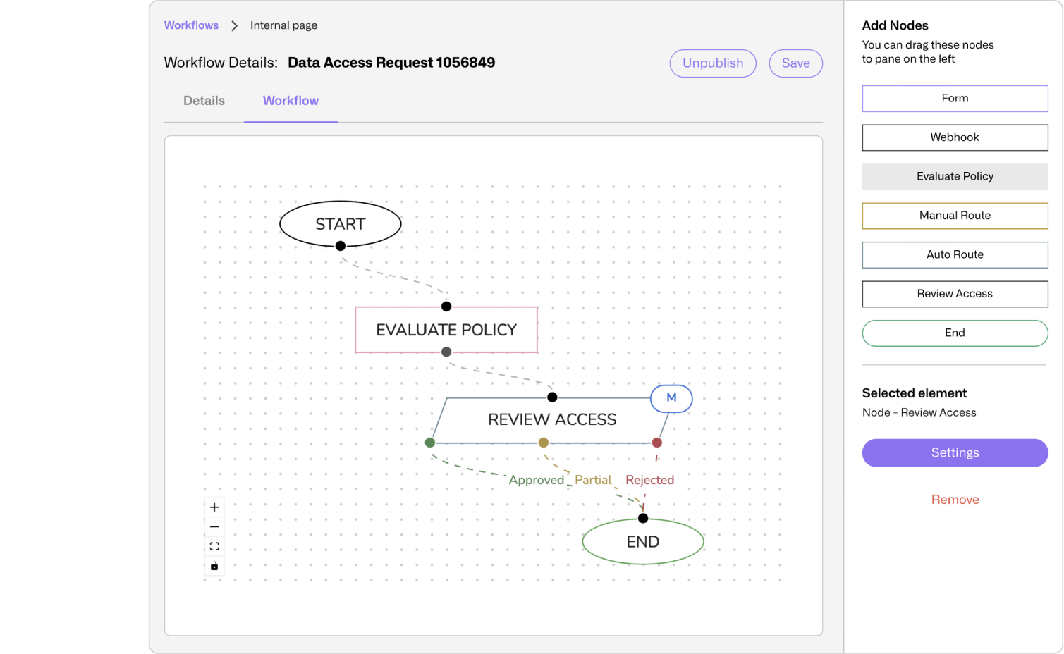
The Workflow Builder enabled technical support staff to build automation processes for granting access to sensitive data.
While functional, the feature suffered from major UX issues:
confusing navigation, hidden fields, and disjointed transitions between different parts of the system that disrupted workflow.
Only experienced users were able to complete a full flow, and even then, with difficulty.
The editing area was unintuitive and lacked guidance on required actions per node. Users had to manually select and configure node types, connect them, and even add Start nodes, despite these being essential to every workflow.
Disjointed navigation: Users were required to create entities in different parts of the system, with no seamless return to their previous workflow.
An example of this is the Node Form, which required prior setup of a form in a different area of the system.


Expectation mismatch: The interface relied on users to proactively click the settings button, even when essential configurations were required, without any prompts or guidance indicating their necessity.


Non-intuitive placement: The core Workflow editing area was hidden in a secondary tab, not readily accessible from the main screen.
Cognitive and Psychological Diagnosis
Cognitive Load
Users were required to remember terms, steps, and entities from other screens without direct links or recognition support. Inconsistency and complex navigation demanded unnecessary memory resources.
Unfocused Attention
Key elements, such as the critical settings tab, were not in the visual spotlight.
Essential information was hidden, while less important details took center stage.
Repeated Failure Experience
Due to the placement of required fields and unclear error messages, users developed a negative learning experience, expecting frustration rather than success.
Low Motivation
The feeling of "this isn't for me" emerged because the design did not match users’ actual knowledge level. There was no sense of control or capability built into the experience.

The Research
User Research & Understanding
- Conducted in-depth observations of TCS work processes.
- Identified the need to balance operational simplicity with flexibility for complex workflows.
- Competitive analysis provided insights into effective information hierarchy and clear UI patterns.
Translating to UX Process
- Mapped user tasks and primary use cases.
- Derived insights from user needs, frustrations, and expectations.
- Converted insights into concrete design opportunities.
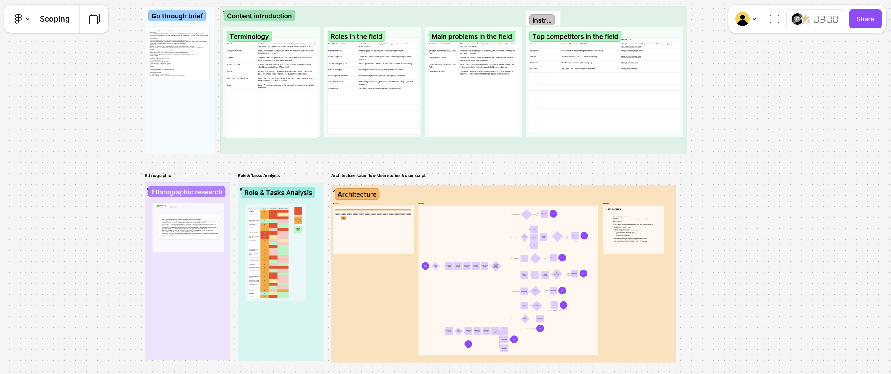
Design and Prototyping
- Created wireframes focused on optimizing workflow.
- Prioritized progressive complexity exposure and vital information placement in the main tab.
- Leveraged an in-house design system that I manage for a streamlined design process.

Collaboration
- Worked closely with the CPO and R&D team.
- Structured work into phases to allow early testing and iterative refinement.
- Conducted usability testing with the TCS team throughout the process.
UI Decisions
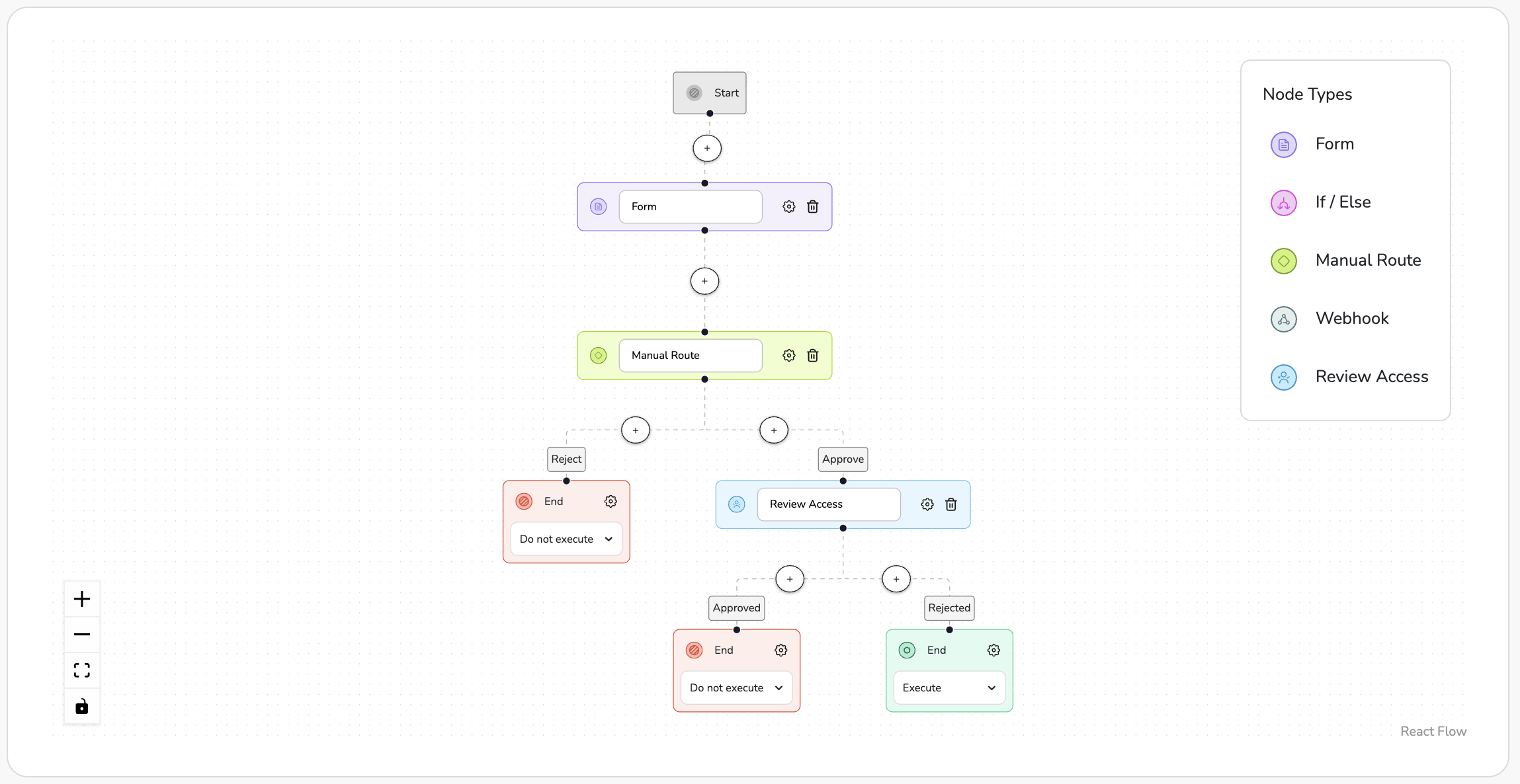
Automatic Connection Between Nodes
Previously, users had to manually drag each node from a side menu, which often led to mistakes and disconnected nodes.
Now, every new node is automatically connected to the insertion point in the Workflow.
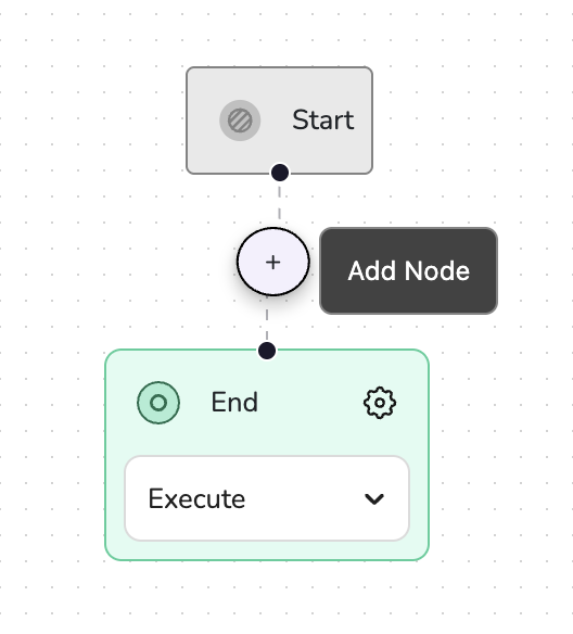
Adding Nodes from Within the Workflow
Instead of an unclear side menu, nodes can now only be added via a "+" button placed between two existing nodes, ensuring proper connection every time.
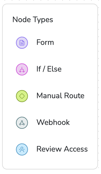
Clear Visual Identity
Each node type was given a distinct color, icon, and style, making the overall structure of the Workflow immediately understandable at a glance
Predefined Start and End Nodes
Every Workflow begins with Start and End nodes. By default, the End node is set to "Execute," with the option to quickly change it from the main screen
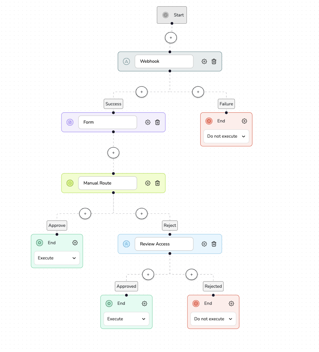
Solution
The new design consolidated all actions into a unified workspace, with a clear visual hierarchy, clear indications for mandatory fields, and support for both linear and parallel workflows.
The interface guided users through the process via an advanced wizard, with extended configuration options for power users.
Business Impact
- Dramatic reduction in support requests.
- Significant drop in technical ticket volume.
- From a marketing perspective – the feature became a key value proposition in sales demos.
Key Learnings
Personal
The importance of involving the development team early in the design process to assess technical feasibility.
This collaboration helped avoid rework later on and ensured that the proposed solutions were both innovative and realistically implementable.
Process
During the design process, I identified a significant blind spot: the system was originally designed for end-users, but in practice, it was the technical customers support team who used it on a daily basis.
This created a gap between the actual needs and the solutions provided. Recognizing this shifted the direction of development and led to a much more accurate alignment with the real user persona.


I’m a UX/UI designer who enjoys turning complex systems into intuitive experiences. I love working where user needs, product goals, and technical limitations come together, bringing clarity to the unclear through thoughtful, curious, and ever-evolving design.
Whether it’s early-stage ideas or polished products, I focus on making a real impact: streamlining workflows, solving problems, and crafting experiences that just feel right. I’m all about diving into research, asking questions, untangling messy processes, and designing interfaces that make everything click.